IOR Global needed to modernize how they managed global talent and language programs across a fragmented set of systems, manual processes, and disconnected tools. Caxy partnered with IOR to design and build a unified mobile app and portal that streamlined workflows, centralized data, and created a seamless experience for program managers, consultants, and assignees alike.
RESULTS
The result was a scalable, integrated platform that replaced outdated manual processes with intelligent automation and a modern, user-friendly interface.
Modernizing Relocation Benefits
Role: UI/UX Designer
Duration: 2019 (4 weeks)

Setting the stage
Executive Summary
Relocation Management Companies (RMCs)—the firms that companies hire to manage the logistics of employee relocation—largely stayed out of the technology revolution that swept through many other industries. Faced with slow adoption of digital process balanced with a need to drive cost down, increase compliancy and update aging legacy software; IOR Global Services, tapped Caxy to help build a reliable REACT platform. Over 8 weeks, using agile and human-centered methodologies, we were able to analyze IOR’s workflows and produce task-driven workflows in a mobile-first Progressive Web App
As lead designer for the project, I was involved in all phases of the project from research and design to production. Tasks included converting user insights into wireframes, creating high fidelity mockups as well as some light branding. I worked directly with project managers, developers and the client to produce an improved digital experience for their users.

IOR Global City Guide | Desktop and Mobile Web
Problem statements & goals
IOR Global operated across a fragmented ecosystem of disconnected systems; including Excel spreadsheets, manual fax and two different legacy systems, that created significant inefficiencies. The lack of integration between these tools meant that data had to be manually transferred, duplicated, and reconciled, increasing the risk of errors and slowing down critical workflows. Pricing structures were particularly complex, stored inconsistently across systems and requiring manual overrides and spreadsheet management rather than a centralized, reliable source of truth. Program managers, consultants, and accounting teams were forced to work around system limitations rather than through them, creating bottlenecks in billing, reporting, and client communication. IOR needed a unified, modern platform that could consolidate these workflows, improve data integrity, and deliver a better experience for both internal staff and end users.
Discovery & Design
Discovery
Sprint 1: Discovery
Using lean UX, agile methodologies and human-centered practices, over 4 weeks, we developed a process to understand and build the unique combination of structure, content and user experience that would accomplish our clients goals. Since this project was built from the ground-up we started our process with discovery and research.
Sprint 1:
-
Business and user goals
-
User stories & Personas
-
Information architecture
-
Style guide & Moodboard
Sprint 2:
-
Wireframes
-
Design system
-
High fidelity comps
-
Prototype user flows
Before any design or development we worked with the client in a breakout workshop to discern their biggest pain points and how to validate them within the features within the app. By having a better understanding of the core business goals, users, their roles and most common pain points we were able to walk away with key insights and questions to answers during later stages in the project.
Design Goals
Leverage new software to:
-
Establish a scalable design system of reusable components, templates and style guidelines rooted in IOR Globals existing brand standards.
-
Prioritize a mobile-first user experience while ensuring seamless transition to tablet and desktop
-
Simplify complex workflows by reducing cognitive load with intuitive interfaces and user experience heuristics.
-
Drive consultant compliance and performance by creating design tools that make it easier to track assignee progress, accountability and meet program requirements.
-
Design for multiple user roles, creating clear, role-appropriate vies and permissions.
Opportunities:
-
Centralize information hub by replacing decentralized documents sharing with a single platform broadening connection.
-
Unify platform architecture by consolidating aging systems (Gateway & IRMA), and manual workflows into a single, integrated system.
-
Improve consultant performance tracking by giving consultants the tools to easily analyze, monitor, and track assignee progress and program performance.
-
Create smarter pricing management by centralizing complex, client-specific pricing into a reliable source of truth.
-
Streamline client communication by providing assignees with a direct, intuitive channel to reach consultants and program managers with program-related questions.
-
Modernize client-facing experience by building a mobile app giving assignees and consultants a centralized hub for program management
-
Lower relocation program costs by enabling better monitoring, compliance tracking, and performance insights.

Feature prioritization from workshop

Feature prioritization from workshop 2
User Stories:
-
Building on the initial discovery research, we leveraged user stories focusing on the needs of each user type and their role: IOR Consultants (Destination Service and Language Training consultants), IOR admin and most importantly Assignees (new and returning).
-
A user story is short, specific and goal-oriented. It is a one-sentence statement that tends to have the following structure: “As a ____, I want to ____, so that ____” (see below).
-
User stories are collaborative design tools. All project stakeholders are expected to participate in the definition and sorting of user stories.
-
User stories focus the project on the perspective of those who will use it.
"As a Program Manager, I want to check the status of the assignee, so that I can make sure they are on track"
To create the user stories we conducted cognitive walkthroughs, taking a step-by-step approach to understanding what task and goals would be accomplished at each screen. This collaborative effort helped us to describe pieces of functionality from a user’s point of view and identify content gaps while aligning team assumptions.

Feature prioritization from workshop 2
Information Architecture
The product IA is divided into three core services, Language Training, Cultural Training and Destination Services; this hierarchy level was established to optimize what information a user sees and represents the three main service hubs where user goals occur. During this session our objective was to mitigate confusion by limiting , since a user could technically be assigned to one of these of service hubs, two or all three.

Sitemap showing an overview of the hierarchy levels

A detailed breakdown of IOR’s core service hubs.
Design Phase
Sprint 2: Visual Design
Wireframing
Businesses use paper. Organizations in every vertical have always relied on a certain quantity of paper, despite the rise of digital formats. After gaining initial insights from Discovery I worked with UX to analyze content types from IOR’s library of documents the consultants use as part of their job roles. These findings helped to inform design decisions as part of the wireframing process. Having a high-level understanding of these content types also helped when considering the reusability of the design system to come.
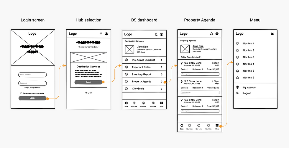
[WIREFRAMED USER FLOW]
Wireframe showing a returning user flow from Login to Property Agenda.
Style Guide
Never let anyone tell you moodboards aren’t important. They help with client adoption, by allowing them to see their brand in context and helps to determine the look and feel of the digital experiences.
To bridge the gap between moodboards and wireframes I worked with a UX designer to create what would become IOR’s component library. This style guide helped to affirm tangible, visual design elements, like colour palette, font, and user controls.
Wireframe showing a returning user from Login to Property Agenda.

Wireframe showing a returning user visiting the Pre-Arrival Checklist
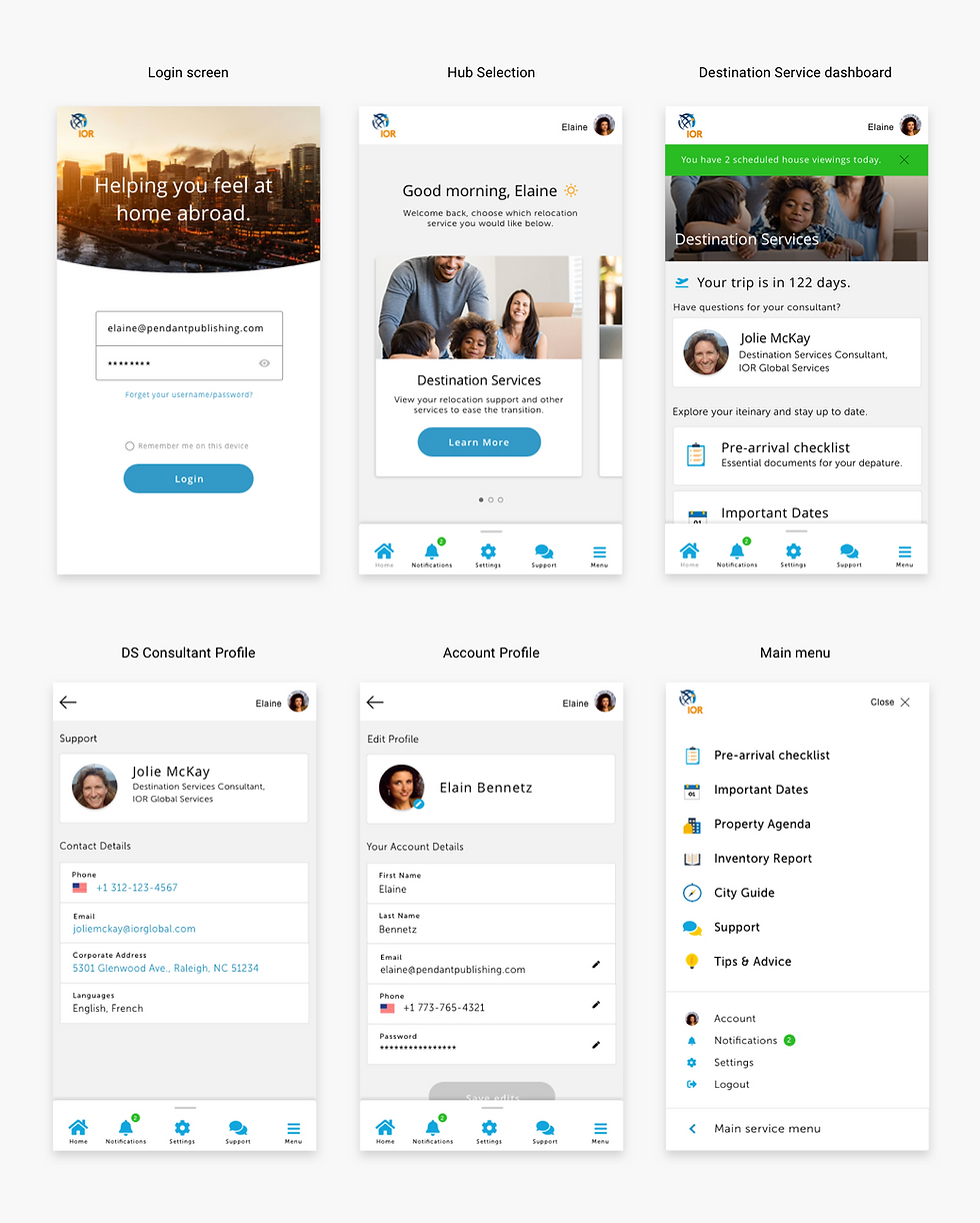
High Fidelity Mockup
With the style guide approved, I applied it across mid-fidelity wireframes, iterating on consistency as the design system took shape. Core components like containers, cards, user controls, and custom iconography were built mobile-first, requiring deliberate decisions around layout and white space to ensure the experience held up equally well on desktop.
To scale the component library efficiently, I leveraged Bootstrap and Material Design as a structural framework, keeping focus on visual and brand execution. The final system delivers clean, reusable UI components with a minimal, purposeful touch.

Wireframe showing a returning user visiting the Pre-Arrival Checklist

Wireframe showing a returning user visiting the Pre-Arrival Checklist
Wireframe showing a returning user visiting the Pre-Arrival Checklist

Wireframe showing a returning user visiting the Pre-Arrival Checklist
Conculsion
By working closely with stakeholders and iterating through real workflows, the IOR project brought order to a scattered mix of disconnected tools and manual processes. Each design decision was shaped by the day-to-day realities of program managers, consultants, and assignees. The result was a unified platform that centralized information, improved communication, and gave IOR the visibility to manage global relocation programs more effectively.
This project was a strong reminder that complexity lives in the details. Digging into the built-up workflows across billing, pricing, and communication showed how important it is to fully understand a problem before jumping to solutions. I learned that building a style guide and design system early pays off quickly, keeping a product with many moving parts feeling consistent and manageable as it grows.
