Zaxby's built momentum around its Signature Chicken Sandwich launch with a bold, military-themed campaign. But they needed a way to bring kids and families into the fold without softening the campaign's vision. I developed the Zaxby's Intelligence Agency (ZIA), an espionage-themed campaign inspired by real three-letter agencies. I built the concept, tone of voice, visual identity, and multi-channel creative from the ground up; giving Zaxby's a playful world that could live alongside the parent brand and give a new audience a reason to engage.
RESULTS
In the end, we built a fully realized sub-campaigne with its own identity system, social presence, and interactive content strategy, turning a single product launch into an ongoing platform that expanded Zaxby's reach beyond its core audience.
Building the Zaxby Intelligence Agency
Role: Art Director and Designer
Duration: Jan 2021 (2 weeks)

Setting the stage
Executive Summary
Zaxby's was deep into its Signature Chicken Sandwich launch, built around a bold "Chicken Sandwich War" campaign with military-grade branding: classified stamps, top-secret language, and a navy-and-red palette steeped in government agency aesthetics. The brand needed to extend that momentum into a new audience — kids and families — without diluting the original campaign's edge. I was tasked with developing the Zaxby's Intelligence Agency (ZIA), an espionage-themed sub-brand that could live as its own activation ecosystem: complete with a distinct tone of voice, visual identity system, logo lockups, social presence, and interactive "missions" that invited a younger audience to play along. The work spanned brand strategy, creative direction, tone-of-voice development, and multi-channel execution across social, web, and email.

Zaxby's Signature Sandwich military themed landing page
The Brief
Zaxby's had successfully positioned the Signature Chicken Sandwich launch as a wartime operation — limited locations framed as "outposts," product reveals treated as classified intel, and messaging that leaned into the competitive intensity of the chicken sandwich wars sweeping QSR. The campaign resonated, but it was speaking primarily to an adult audience already tuned into that cultural moment.
The brief was to build a parallel brand world that could activate kids and families while staying tethered to the military campaign's DNA. The challenge was tonal: the existing work was confident and combative, but a kids activation needed to be inviting, playful, and participatory without feeling like a completely different brand. There was also a structural challenge — this wasn't a one-off ad, it was a sub-brand that needed its own identity system, social channels, content strategy, and engagement mechanics, all developed on a compressed timeline targeting a March 1st launch.
The competitive landscape added urgency. Every major QSR player was fighting for attention in the chicken sandwich space, and most were doing it with straightforward product marketing. Zaxby's had already differentiated with narrative and world-building; the ZIA needed to push that advantage further by giving audiences something to do, not just something to see.
Art Direction
Strategy & Insight
The core insight was that espionage as a genre naturally bridges adult and kid audiences. Adults associate spy culture with sophistication (Bond, Cold War intrigue); kids associate it with adventure and play (secret codes, gadgets, hidden identities). By anchoring the campaign in espionage rather than furthering the military theme, we could build a world within a world that felt tonally cohesive with the Signature Chicken Sandwich campaign but visually and emotionally distinct.
From that insight, the team developed two creative directions to test how far the tone could stretch. Direction 1 leaned into classic, cinematic espionage, drawing from the aesthetic of movies and retro tv series. The humor was deadpan and dry, played completely straight. Direction 2 went illustrative and playful, pulling from Atomic retro style animations with it's textures, simple shapes and colorful aesthetics.
The strategy between the two directions wasn't just aesthetic; it was a question about how much the sub-campaign should feel like Zaxby's versus how much it should feel like its own universe. Direction 1 kept the Signature Chicken Campaign closer; Direction 2 gave the ZIA more room to build its own following and content engine. Both directions included full social channel mockups, logo systems, and sample content to make the tradeoff tangible for the client. This gave Zaxby's something its competitors lacked: a reason for families to follow, return, and engage beyond a single product launch window.
Creative Execution
The work started with defining what the ZIA actually was. Not just a logo, but a fictional agency with its own personality and internal logic. I built the concept around the idea that the ZIA operates like a real intelligence agency, one that happens to be obsessed with chicken and secret sauces. That framing gave every piece of creative a consistent voice to work from.
I built out each direction as a complete brand system: logo lockups, color palettes, tone of voice, and a library of branded assets. The work extended across social channels, dedicated landing pages, email campaigns styled as mission briefings, and concepts for ongoing "missions." The social strategy was meant to be written entirely in-character, with agent spotlights and posts from the ZIA's perspective. This gave the channels a feeling of discovery like a real agency, not following a brand promotion.
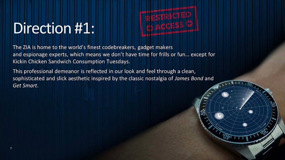
Direction #1 Overview

Direction #1 Reference

Direction #1 Tone of Voice
Direction #1 Logo Lockups

Direction #1 Brand Assets

Direction #1 Overview

Direction #1 Reference

Direction #1 Tone of Voice

Direction #1 Logo Lockups

Direction #1 Brand Assets

Side-by-side art directions.
Results
Zaxby's chose to move forward with Direction 2 for its retro illustrative style, colorful palette, playful tone and qualities that better suited a family audience. This strategy gave the ZIA the most room to grow as its own campaign and brand.
The final deliverable was a complete creative playbook ready for a full launch: identity system, tone of voice guidelines, social channel templates, mission content frameworks, and a library of stickers and GIFs, all delivered on a compressed timeline.
The ZIA gave Zaxby's something most QSR brands don't have in their chicken sandwich arsenal, a content platform with its own audience, voice, and engagement loop that extended a single product launch into an ongoing relationship with families. Check out the rest of the campaign below.
Zaxby's Signature Sandwich military themed landing page
Logo lockups and variation
Wireframe showing a returning user from Login to Property Agenda.

Wireframe showing a returning user visiting the Pre-Arrival Checklist
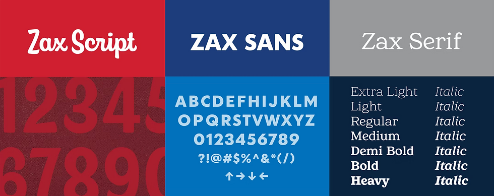
Zaxby's brand fonts used throughout the campaign
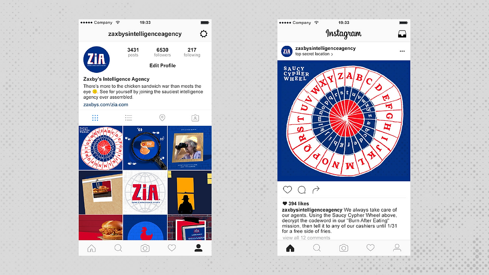
Social media driven engagement post

ZIA promotional billboards next to competitor restaurants.

Atmospheric content highlighting potential brand activation engagements.

Facebook profile page and catchphrase
Reflection
The biggest takeaway was about restraint in world-building. The work was strongest when we trusted the audience to play along rather than over-explaining the concept. The simplest ideas included agent badges, cipher wheels, and deadpan captions landed best because they gave people just enough to feel like insiders without making them work for it.
If I revisited this project, I'd push harder on the interactive mission mechanics. The cipher wheel hinted at what was possible, but there was a real opportunity to build a progression system with tiered missions and unlockable content that could have driven longer-term engagement. The foundation was there; the timeline just didn't allow for it.